It has a subtle East meets West theme inspired by the owners, who grew up in South East Asia and are ethnically Anglo-Chinese.
A House That Meets the Heart …
When you arrive at the house you enter via a formal pedestrian entry. Beyond that is a contemporary Chinese garden which in itself is a playful expression of east meeting west. A bridge over a dry riverbed directs you to the office at the rear. The office can accommodate several people and has its own bathroom and kitchenette. This allows for future use as an additional bedroom or granny flat. Resale is always an important consideration and most of the spaces were designed to be flexible in use. It was agreed that one of the most unsustainable things in houses is doing premature renovations. This house was designed with a long-term vision in mind.
Life is Art. Live a Masterpiece.
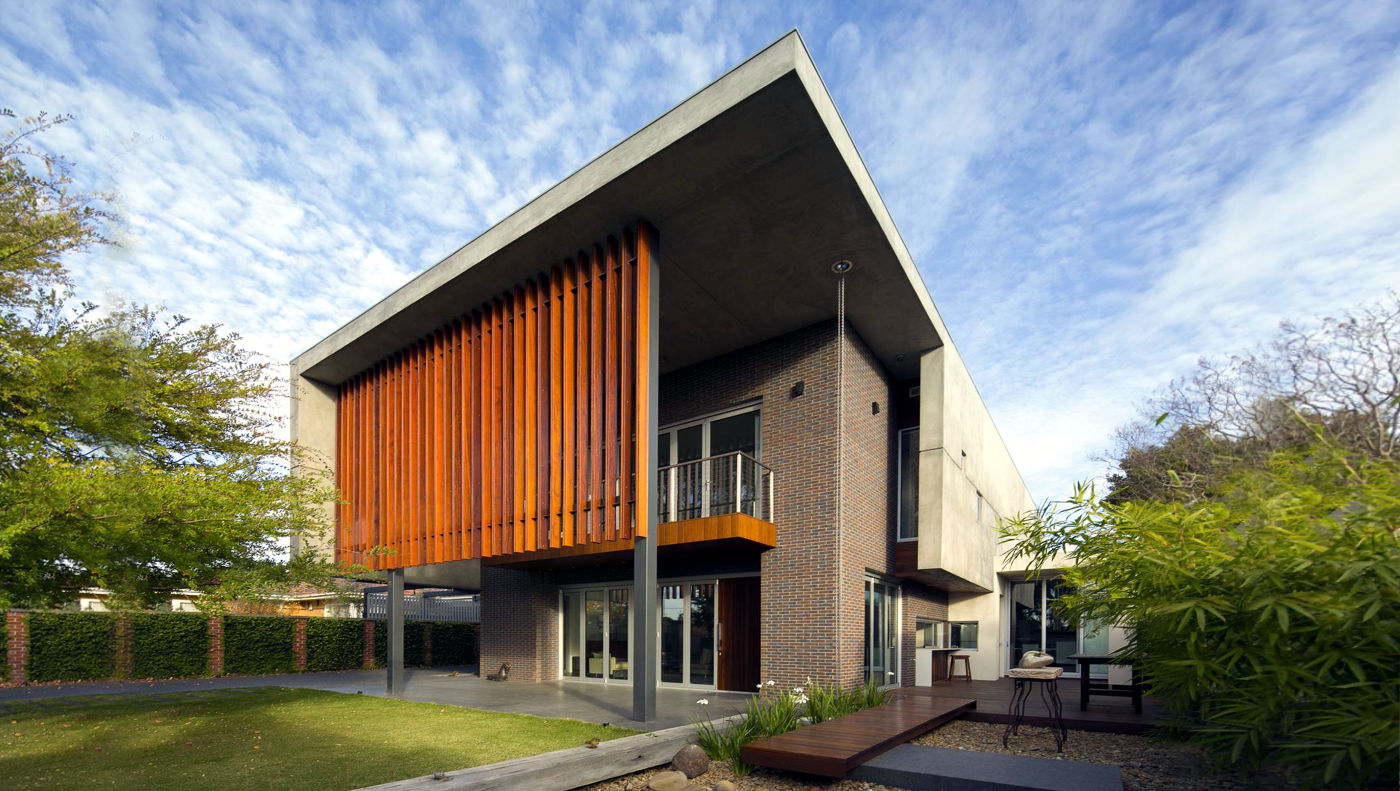
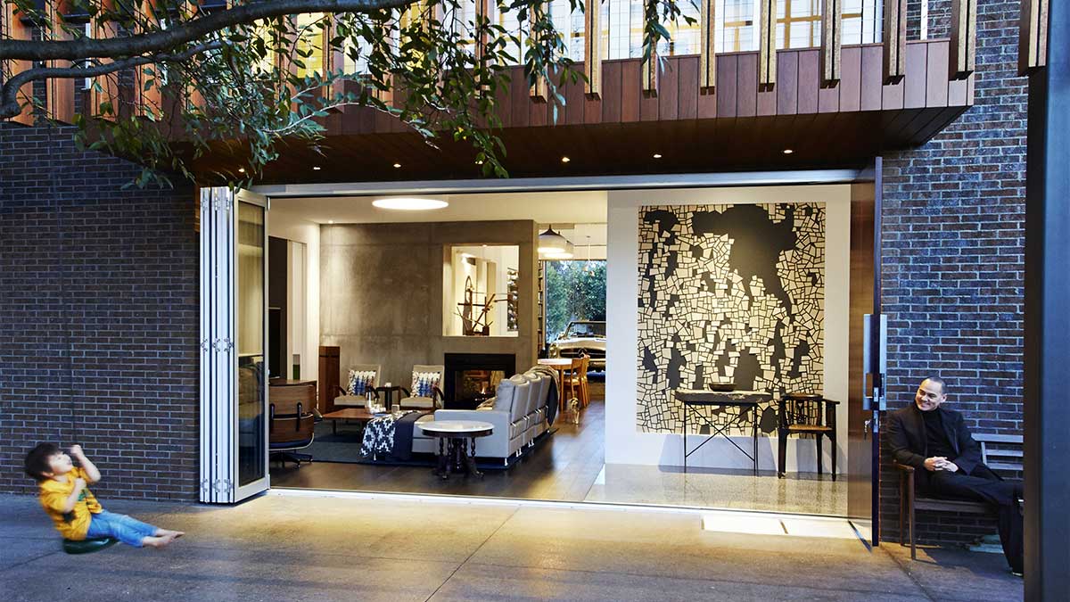
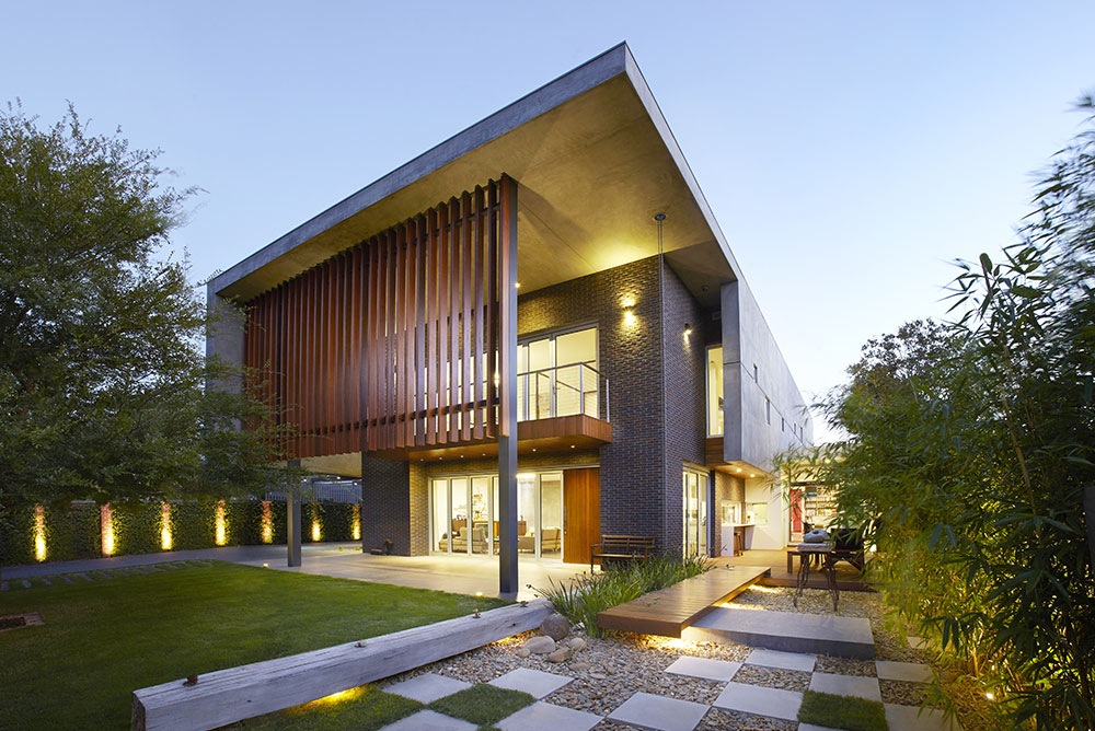
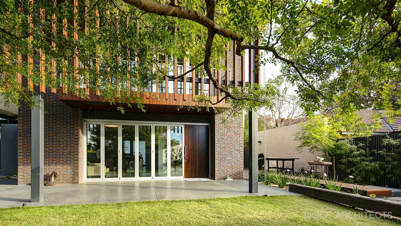
At the front of the house is a large north-facing yard, which provides a great space for children to play privately and securely. It leads onto a generous double-height front porch, which then directs you into the house. The front porch has a dark polished concrete floor with a sealant that allows for the floor to also be a large blackboard for children to draw on. The main living space opens onto this northern yard with a set of quality commercial-grade bi-fold doors which open completely. The floor level between the inside, front porch and lawn is very slight and this further blends the inside to the outside.
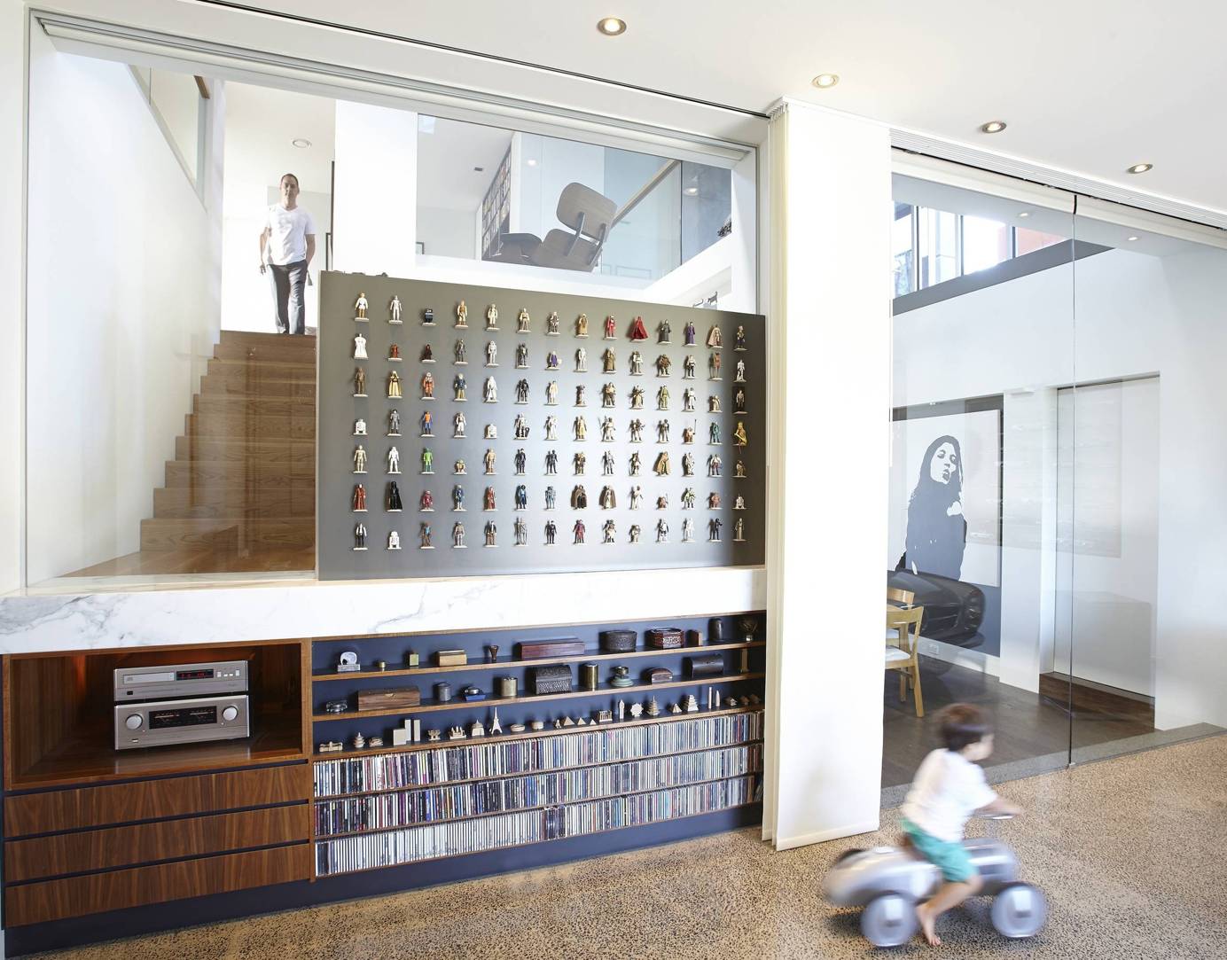
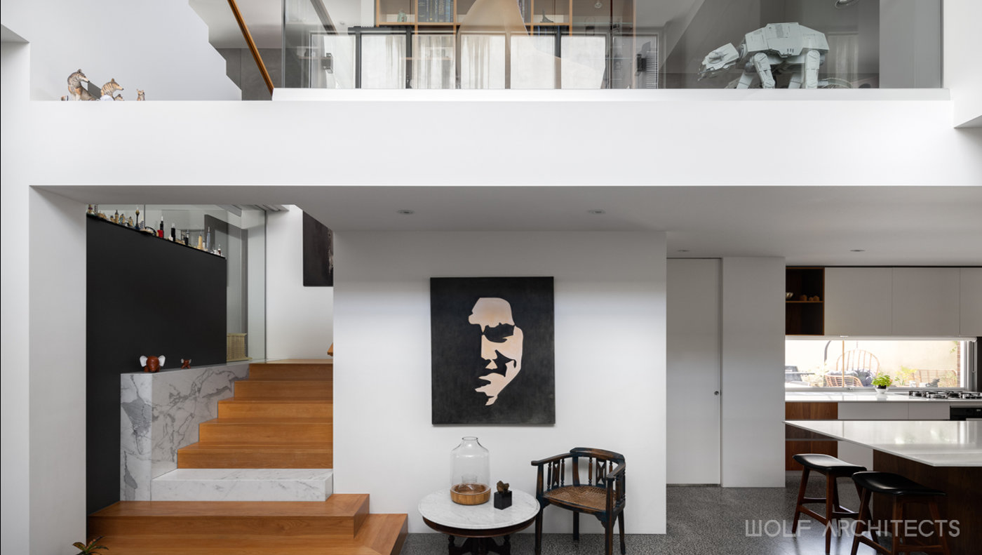
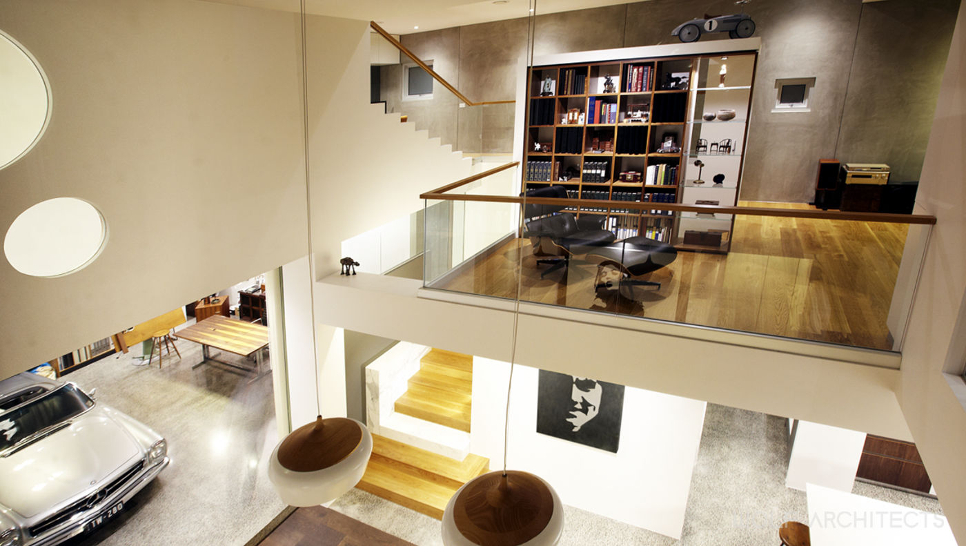
Entry into the house is through a large walnut-veneered door. Instead of a sculpture ahead or painting hanging on the wall, the wall is in itself a piece of art. This approach was taken throughout the house with many of the family’s collections. The objects for display are integrated into the architecture. The Star Wars action figures for example, are on individual stands on a wall and this forms a part of the walls texture making the whole display a feature in the interior architecture.
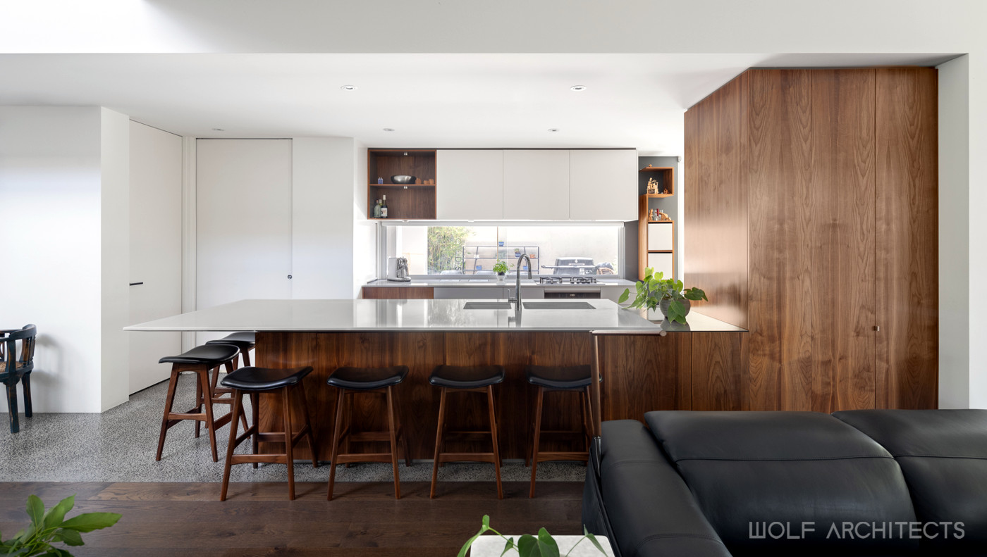
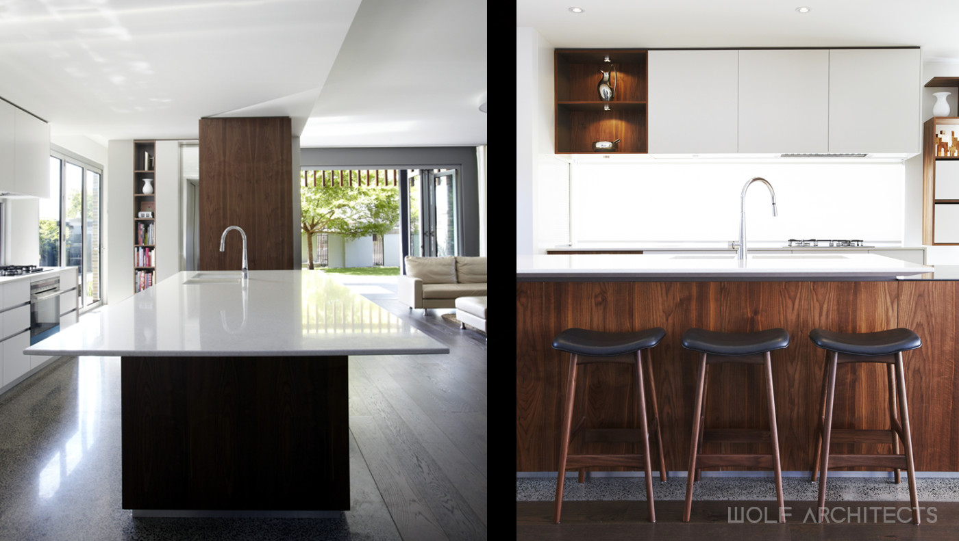
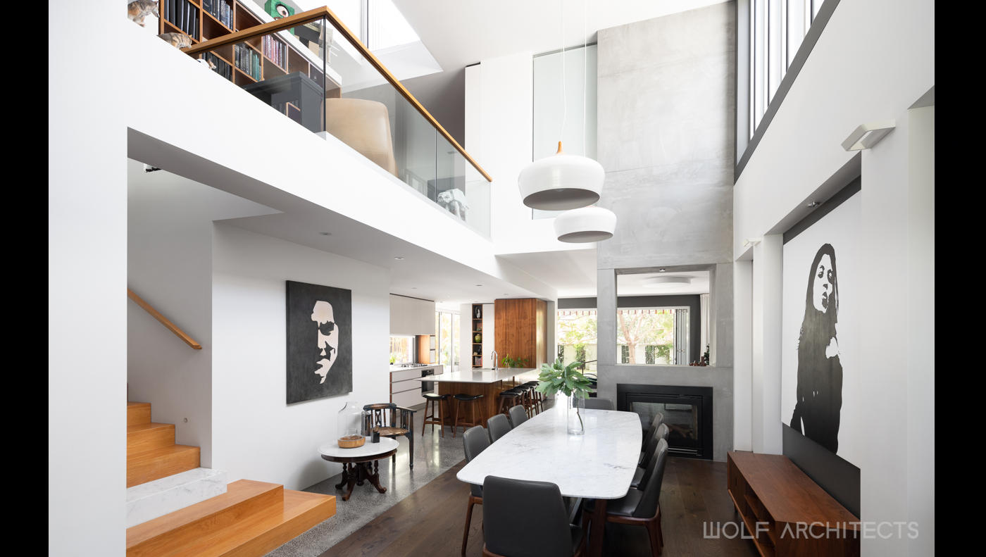
The heart of the ground floor is triangulated by the living, dining and kitchen spaces. These areas were considered in the brief to be where the family spend most of their time together and therefore had to be interconnected. They are separated primarily by a double sided fireplace, an example of clearly defined spaces without walls. The kitchen is positioned at the western point of the triangle and acts as a control tower from which most of the house and landscaping beyond can be overseen.
Enhancing Everyday Living…
Encouraging Connectivity Throughout…
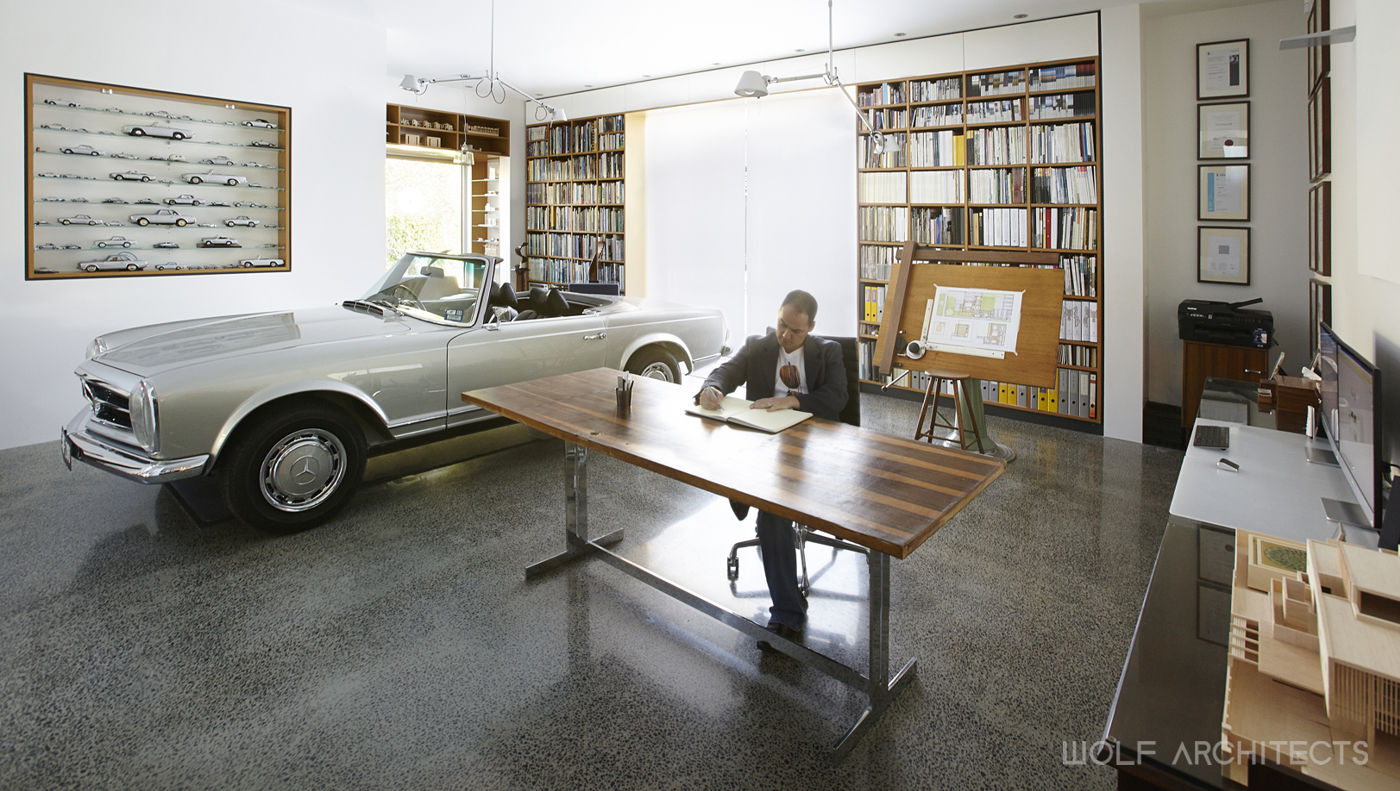
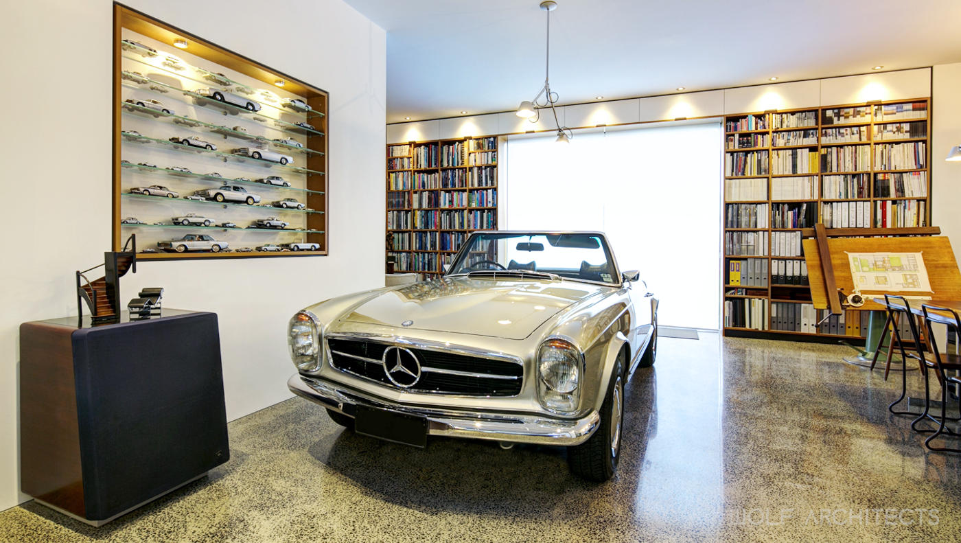
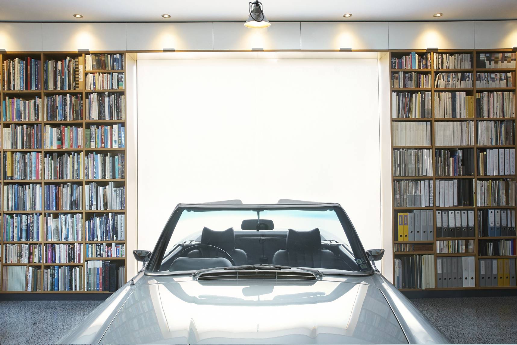
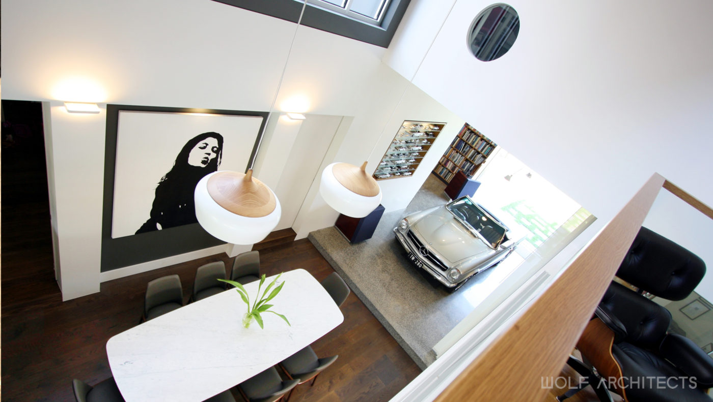
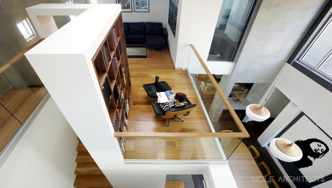
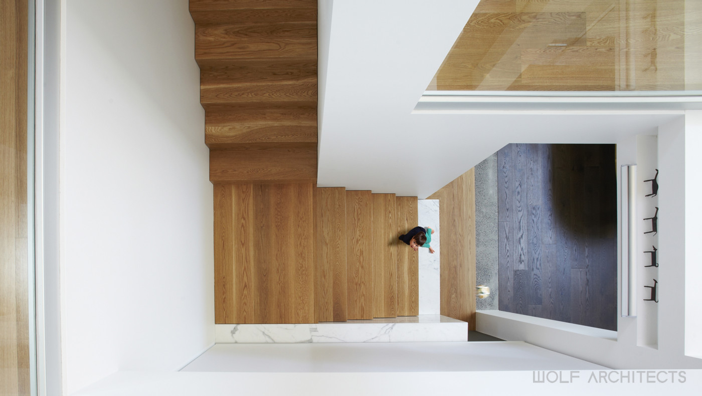
The residence is separated from the office by an operable glass wall located at the southern end of the dining room. Within the office is a space for one of the classic cars. The dining room is at the bottom of the vertical corridor, and by looking upwards, one understands why the house is so light-filled. Light penetrates in most areas from multiple windows. No artificial light is required throughout the day and at night the house’s lighting is almost 100% LED. The dining room is strategically placed in the centre of the home and with a large void above it to enhance the feeling of sacredness, representing how the family regards meal times spent together daily.
The site was not without its challenges. Certain elements of the previous 1940’s residence we retained for cost-saving reasons and in consideration of embodied energy and sentimental value. These areas included:
– The existing master bedroom and ensuite which had been renovated several years prior
– A yellow brick tunnel which now has a mural painted by the owner
– The front fence
– The rear yard
– A large 4-car tin shed
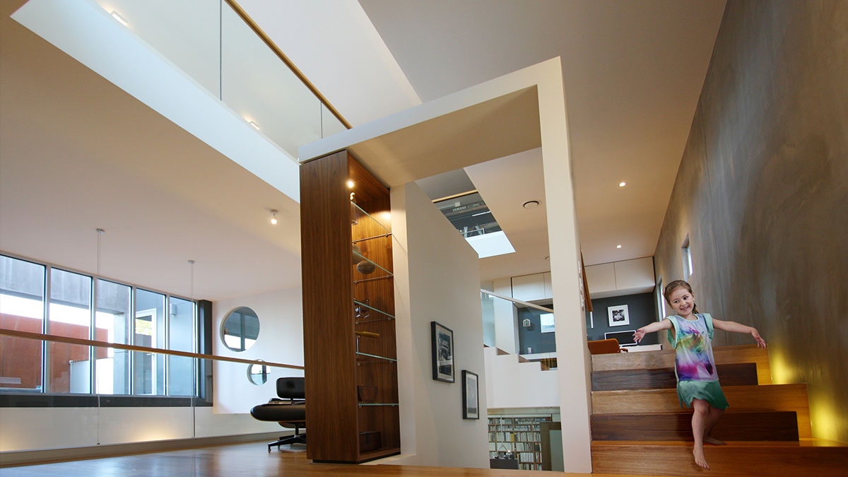
The result was a house that consisted of 28 interconnected spaces unfolding over 10 subtle level changes. The key to the design is a multi-purpose vertical corridor which acts as a thermal chimney. It also allows for many internal views and vistas which are integral to the houses connectivity. Light can also penetrate through the space, allowing the Northern sunlight to penetrate to the deepest parts of the house.
A Home that Brings the Family Together…
It has a subtle East meets West theme inspired by the owners, who grew up in South East Asia and are ethnically Anglo-Chinese.
A House That Meets the Heart …
When you arrive at the house you enter via a formal pedestrian entry. Beyond that is a contemporary Chinese garden which in itself is a playful expression of east meeting west. A bridge over a dry riverbed directs you the office at the rear. The office can accommodate several people and has its own bathroom and kitchenette. This allows for future use as an additional bedroom or granny flat. Resale is always an important consideration and most of the spaces were designed to be flexible in use. It was agreed that one of the most unsustainable things in houses is doing premature renovations. This house was designed with long term vision in mind.
Life is Art. Live a Masterpiece.
At the front of the house is a large north facing yard which provides a great space for children to play privately and securely. It leads onto a generous double height front porch which then directs you into the house. The front porch has a dark polished concrete floor with a sealant that allows for the floor to also be a large blackboard for children to draw on. The main living space opens onto this northern yard with a set of quality commercial grade bi-fold doors which open completely. The floor level between the inside, front porch and lawn is very slight and this further blends the inside to the outside.
Entry into the house is through a large walnut veneered door. Instead of a sculpture ahead or painting hanging on the wall, the wall is in itself a piece of art. This approach was taken throughout the house with many of the family’s collections. The objects for display are integrated into the architecture. The Star Wars action figures for example, are on individual stands on a wall and this forms a part of the walls texture making the whole display a feature in the interior architecture.
The heart of the ground floor is triangulated by the living, dining and kitchen spaces. These areas were considered in the brief to be where the family spend most of their time together and therefore had to be interconnected. They are separated primarily by a double sided fireplace, an example of clearly defined spaces without walls. The kitchen is positioned at the western point of the triangle and acts as a control tower from which most of the house and landscaping beyond can be overseen.
Enhancing Everyday Living…
Encouraging Connectivity Throughout…
The residence is separated from the office by an operable glass wall located at the southern end of the dining room. Within the office is a space for one of the classic cars. The dining room is at the bottom of the vertical corridor and by looking upwards one understands why the house is so light filled. Light penetrates in most areas from multiple windows. No artificial light is required throughout the day and at night the house’s lighting is almost 100% LED. The dining room is strategically placed in the centre of the home and with a large void above it to enhance the feeling of sacredness, representing how the family regard meal times spent together daily.
The site was not without its challenges. Certain elements of the previous 1940’s residence we retained for cost saving reasons and in consideration of embodied energy and sentimental value. These areas included:
– The existing master bedroom and ensuite which had been renovated several years prior
– A yellow brick tunnel which now has a mural painted by the owner
– The front fence
– The rear yard
– A large 4 car tin shed
The result was a house that consisted of 28 interconnected spaces unfolding over 10 subtle level changes. The key to the design is a multi-purpose vertical corridor which acts as a thermal chimney. It also allows for many internal views and vistas which are integral to the houses connectivity. Light can also penetrate through the space, allowing the Northern sunlight to penetrate to the deepest parts of the house.
A Home that Brings the Family Together…

